
Warm, neutral, or cool — the right Kelvin temperature makes all the difference in how your products look and feel
Introduction: It’s Not Just About Brightness
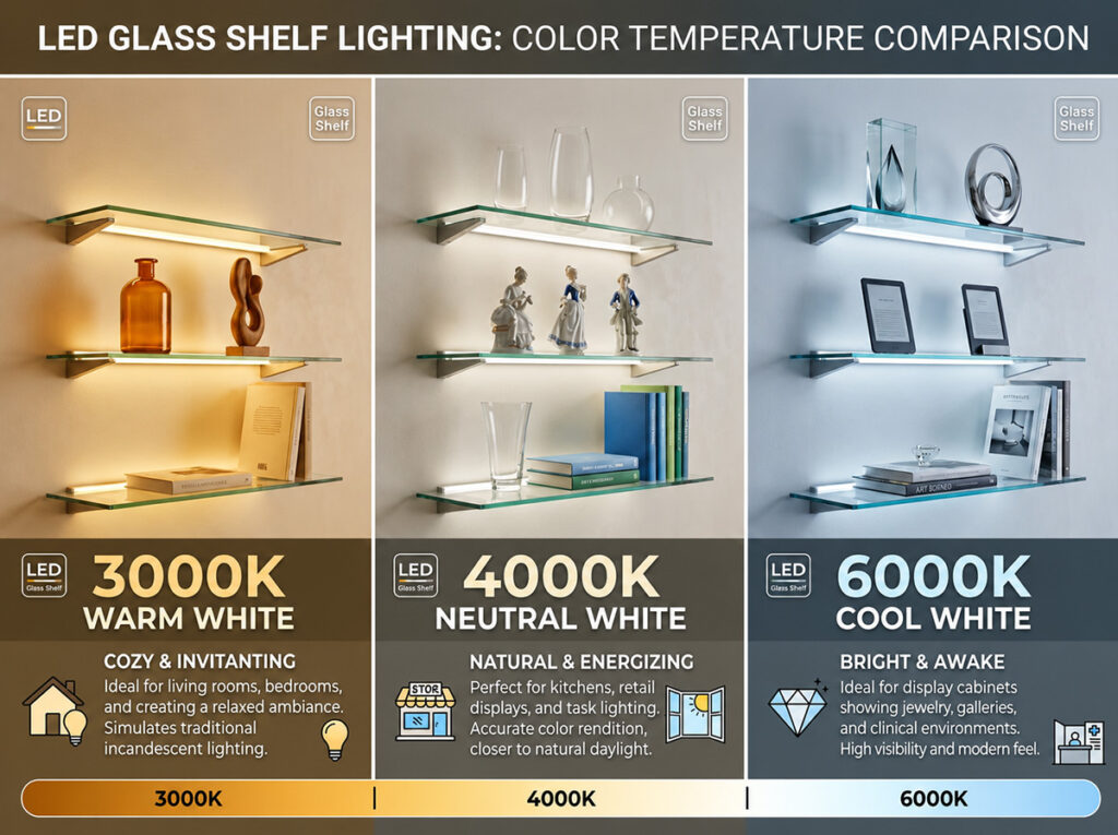
When designing LED lighting for glass display shelving, one of the most critical — and most overlooked — decisions is color temperature. Measured in Kelvins (K), this single specification determines whether your display looks warm and inviting, crisp and professional, or cold and clinical.
In today’s market, the three most popular color temperatures for glass shelf lighting are:
- 3000K — Warm white, cozy and welcoming
- 4000K — Neutral white, clean and versatile
- 6000K — Cool daylight, sharp and high-contrast
Each creates a completely different atmosphere and serves different display purposes. This guide will help you choose the perfect one for your cabinets, showcases, and retail displays.
Understanding Color Temperature
Color temperature describes the color appearance of light, from warm (yellowish tones) to cool (bluish tones), measured on the Kelvin scale.
Option 1: 3000K – The Warm, Inviting Choice 🌟
3000K is the most popular choice for premium glass display shelving. It produces a soft, golden-white light that creates a warm and welcoming atmosphere.
Best suited for:
- Jewelry displays (especially gold and warm-toned pieces)
- Wood finishes and warm packaging materials
- Restaurants, hospitality settings, and luxury boutiques
- Home bars, wine cabinets, and collectible showcases
- Vintage or antique displays where warmth is essential
Why choose 3000K:
- Makes gold, brass, and warm-colored items look rich and luxurious
- Creates a cozy, inviting atmosphere that encourages customers to linger
- Flatters wood, leather, and warm-toned materials
- Reduces harsh shadows and feels more natural in residential settings
Note: Many leading display lighting manufacturers offer 3000K as their standard warm-white option for glass shelving applications.
Option 2: 4000K – The Neutral, Versatile Workhorse ⚖️
4000K is the safest and most versatile choice for commercial displays. It provides a balanced, neutral white light that combines clarity with comfort.
Best suited for:
- Retail stores displaying mixed merchandise
- Silver, platinum, and watch displays
- Office and commercial interior displays
- Product showcases where accurate color rendering is important
- Mixed displays with both warm and cool-toned items
Why choose 4000K:
- Neutral white reduces color bias and works with almost any product type
- Enhances visibility without feeling harsh or clinical
- Widely available and considered the “go-to” standard for commercial projects
- Creates a clean, businesslike atmosphere that suits modern displays
Option 3: 6000K – The Cool, High-Contrast Statement 🔵
6000K produces crisp, daylight-like illumination with distinct blue-white tones. It creates high contrast and sharp visibility.
Best suited for:
- Showrooms requiring high visibility and detail recognition
- Art galleries and technical exhibits
- Commercial spaces that want a vibrant, lively atmosphere
- Displays featuring white, silver, or cool-toned products
- Task-oriented environments where precision matters
Why choose 6000K:
- Enhances visual acuity for detailed work and inspection
- Makes whites appear brighter and cleaner
- Creates a modern, high-energy feel
- Best for environments where “daylight-like” quality is desired
Important caution: 6000K can appear clinical and is rarely correct for luxury retail displays — it can make products look cold rather than desirable. It works best in technical or highly specialized displays rather than general retail.
Quick Comparison: Which One Is Right for You?
The Professional’s Recommendation
For glass display shelving, here’s the industry consensus:
- 3000K is the default choice for premium displays — especially jewelry, luxury goods, home cabinets, and warm-toned merchandise. It creates the inviting atmosphere that encourages customers to appreciate and purchase products.
- 4000K is the versatile all-rounder — ideal for retail stores with mixed products, office displays, and situations where you need a clean, professional look without bias toward warm or cool.
- 6000K is for specialized applications — best reserved for high-tech showrooms, galleries requiring precise detail, or environments where daylight-like quality is specifically needed.
For most glass display applications, 3000K remains the most popular and recommended choice. It consistently delivers the warm, luxurious feel that makes products look their best and customers feel welcome.
Bonus Tip: Consider Tunable White
If you’re unsure or want flexibility, consider tunable white (CCT-adjustable) systems. These allow you to switch between color temperatures (e.g., 2700K to 6000K) depending on the season, product type, or time of day. This is especially useful for retailers who change displays frequently.
Final Verdict
Need help selecting the perfect color temperature for your glass shelves? [Contact our team / Explore our range] – we’re here to help you create the perfect lighting experience.
#LEDLighting #ColorTemperature #GlassShelves #DisplayLighting #3000K #4000K #6000K #RetailDesign #JewelryDisplay #LightingTips #HomeBar #CabinetLighting #InteriorDesign
Request Pricing & Technical Details
Please fill in the form below and our team will reply within 24 hours.
